THESE 7 COLOR WILL BE EVERYWHERE IN 2023
28/05/2023
There isn’t a shade or color I’ve ever seen that I haven’t liked,” Mario Buatta, with characteristic wit, observed. The late great decorator, who passed away in 2018, would be pleased, then, to see the spectrum of shades and tints that are poised to dominate our homes in the year ahead. Gone are the days of straight-laced, all-white rooms; instead, as we emerge from three (have we got that right?) years of uncertainty, experts predict a rainbow-bright renaissance.
“The colors [consumers] choose are reflecting their mood—and they are much freer in how, when, and where they use it on themselves and in their homes,” Gemma Riberti, head of interiors at the trend forecasting agency WGSN, tells us. “Going into 2023, color is reflecting well-being, discovery, acceptance, transformation, comfort, simplicity, and (why not) pleasure.”
While some of these observations might sound like sound bites from your last therapy session, the It hues we’ve seen come to the fore these last few years show a collective desire for coziness and a closeness to nature (read: green-everything) and more expressive materials (see one of the year’s biggest trends, bold marble). “One of the most significant themes we’ve identified for 2023 is warmth,” Sherwin-Williams’s Sue Wadden affirms. “People are moving away from the cool grays that defined the past decade and exploring hues that exude kindness, serenity, and empathy.”
There were also some surprises in the mix, according to the color experts we spoke to, namely the emergence of a genre of, literally, out-of-this-world colors: “Near-neons and hyper-brights are also making a comeback, driven by the metaverse, with colors making an impact in both digital and physical realms,” Ribaldi says. That entails vivid, bold hues—especially as Gen Zers begin decorating their first homes.
But if you aren’t entirely ready to paint your bedroom acid green just yet, read on for a list of the seven color trends that will be all the rage in 2023.
Green
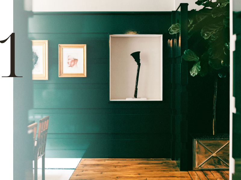
We’ve said it before and we’re going to say it here again: Green shows no sign of fading in our homes, and it’s a surefire bet—whether you opt for a soothing sage or a pale pistachio—the hue will remain in fashion for years to come. “We’ve definitely seen an increased interest in greens this year, with that shade representing three of our top six colorways for 2022,” says Natalie Ebel, copresident of direct-to-consumer paint brand Backdrop. But while last year paint companies were predicting dusty verdant variations (for instance, Benjamin Moore’s 2022 Color of the Year, October Mist), Ebel, along with many of the other experts we spoke to, predicted an uptick in punchier, truer greens. Look no further than Backdrop’s recently released hue, Troop Beverly Hills, a vivid emerald.
What makes green, well, evergreen? International color expert and executive director at Pantone’s Color Institute Leatrice Eiseman, makes the case for its beauty as a neutral. “My students hear me lecture over and over and over again about using green as a neutral color,” she says. “Mother Nature uses it ubiquitously in plants and foliage.” Watch for this hue in everything from marble to tile to furnishings in the year ahead.
Cool lavenders and lilacs
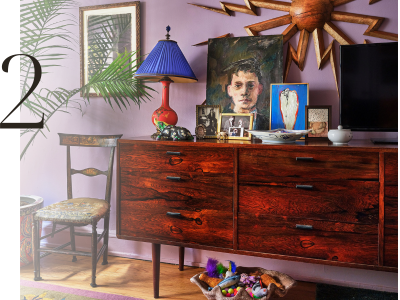
An emerging color trend that demonstrates the power of newly initiated Gen-Z consumers is the rise of soft, dusty shades of lavender and lilac. 1stDibs, the digital antiques marketplace, saw interest in lavender spike in 2022, up to 14 percent over 6 percent approval the previous year. WGSN forecasters, meanwhile, spotted the shade—which they’ve dubbed “Digital Lavender”—everywhere from Jil Sanders collections to Mercedes-Benz concept vehicles to Andrés Reisinger virtual furniture.
Riberti, along with WGSN’s color strategist Clare Smith, predict the color will dominate tabletop and soft furnishings, in addition to our walls. “It’s a sensorial shade that connects to holistic well-being and digital optimism,” they tell us. “This shade poses that much-needed cautious optimism and escapism that people are craving post-pandemic, and even in times of budget crunch, it is imaginative and creative but also speaks of hope and balance.”
It also speaks to nostalgia: Smith and Riberti have noticed it paired with chrome, glass, and other reflective surfaces, an indication that the ’80s are officially back. 1stDibs also saw a correlation between soft powdery pastels and an increase in ’80s-era interest.
Orange
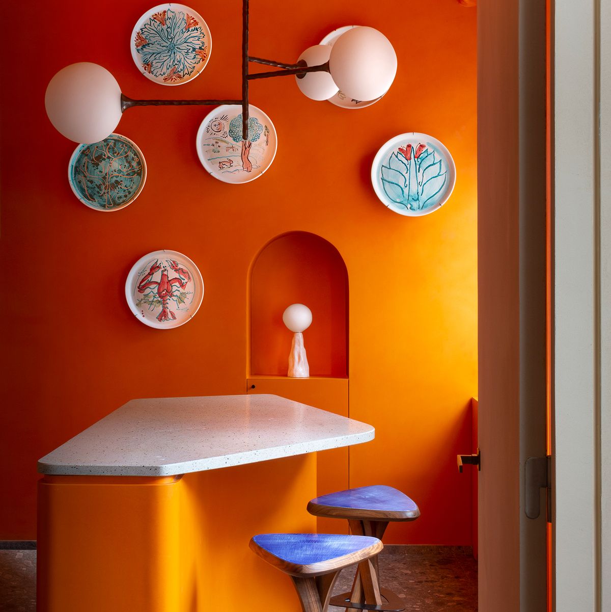
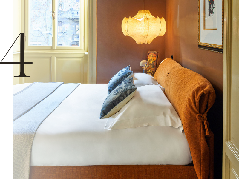
Orange, as Pantone’s Eiseman pointed out, has consistently remained “at the bottom of the totem pole.” But her team’s research has indicated that the hue is “definitely on board for next year.” It’s a trend also mirrored in WGSN’s reporting: “Saturated tones will return yet in solid color statements, enabling new forms of self-expression,” Riberti says, like fiery orange. And while some designers might opt for saturated versions of the shade on walls, many will use the pigment to add pop to furnishings (our Winter 2022 issue showcased an Argentinian home where tangerine was the accent of choice). “It’s the combination,” Eiseman says. “There are creative opportunities to put colors together that really tax your imagination.”
But homeowners and designers are also drawn to earthier, terra-cotta-tinged shades. In fact, according to 1stDibs’s latest trend research, burnt orange was its third most popular color, behind (you guessed it) emerald and sage green.
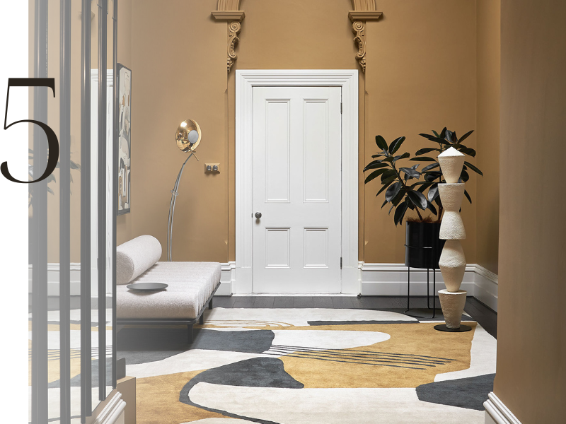
Light Brown
Forget gray; brown is 2023’s new neutral. In fact, all varieties of this cozy shade are appearing in the color forecasting tea leaves. “Light browns, dark browns, and beiges are making a comeback because of their earthiness, meaning they ground us and help us feel more connected to the beauty and restorative properties of nature,” says Wadden of Sherwin-Williams.
Before you start getting flashbacks of generic ’90s tract home dens, consider the versatility of today’s beige: “What we’re seeing with the neutrals is that there are many more nuanced neutrals that seem to have an undertone that really pops out at you,” says Pantone’s Eiseman. ELLE DECOR editors are also spotting a variety of finishes with these trending tints, ranging from lustrous taupe lacquer to textured limewash in spaces from kitchens to bedrooms.
Mustard
Do you prefer honey or dijon? Yellow or hearty whole grain? Whatever your preference for mustard, it’s a go for 2023. In addition to Raspberry Blush, Benjamin Moore named the khaki-colored Savannah Green as part of its forecast for next year. “Almost like gold leaf for your walls, this rich ochre features a balanced undertone of green and yellow,” the hue’s description reads. Chairish, the vintage furniture online marketplace, saw an increase in searches for mustard-colored items on its platform. For our part, we’ve been seeing varieties of mustard everywhere from walls to textured bouclés.
Rose
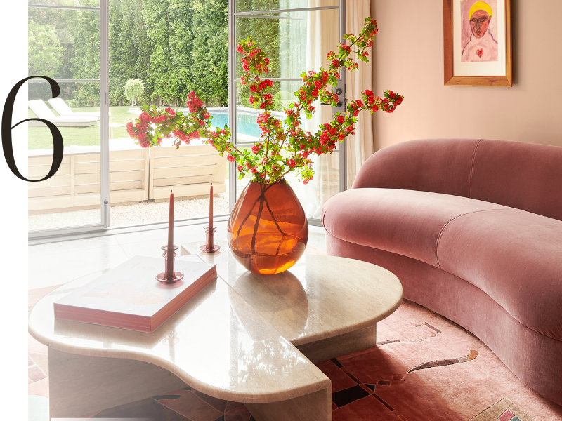
Next year’s outlook is rosy, according to color forecasters—from bright fuchsias to delicate, neutral-leaning pinks. On the subtle end of the spectrum, Sherwin-Williams inaugurated Redend Point, a serene gray-pink, as its 2023 Color of the Year. “This gorgeous hue tells a story about warmth, exploration, and the importance of self-care, and is the perfect example of the warm, versatile, and unexpected neutrals we expect will become increasingly sought after in 2023,” Wadden tells us.
Pantone, meanwhile, named Viva Magenta! as its frontrunner for 2023—a jubilant purply red that felt in line with the digital-first zeitgeist and “this idea of needing more energy, more vimm and more vigor,” Eiseman tells us. Mauve is also making moves, 1stDibs predicts; the company saw a 4 percent increase in interest for mauve in 2022, another indication that the ’80s vibes are in our future. And there’s more: Benjamin Moore named Raspberry Blush 2008-30 as its color-to-watch of 2023. “We love seeing Raspberry Blush on all four walls to make a bold color statement,” Arianna Cesa, the company’s associate manager of color marketing and development notes. “We particularly love it in a dining room as a modern, blushed update on the classic deep red dining room. For those who want to dip their toe into bold color, it’s great for an accent wall, a ceiling, painted furniture, or trim.”
Powder blue
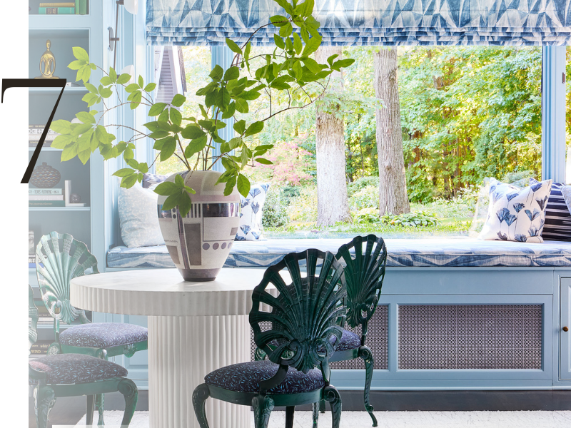
Softness has been trending in a major way across the homefront, ranging from amorphous shapes to fuzzy finishes. It’s also appearing in our homes via pale, powdery blues in particular. Experts say it exemplifies a collective desire for calm in a crazy world: “Luminous powdery sky blues and barely-there pastels will speak to the need for softness and for balance, and help support physical and mental health,” Riberti predicts. Chairish, meanwhile, predicted “French blue,” a pretty cornflower hue, will be appearing increasingly in furnishings and accessories. The sky, apparently, is the limit with this feel-good tint.
Resource: https://www.elledecor.com/design-decorate/trends/a42270281/color-trends-2023/
